Releases
ContentToggle, IconToggle and Expandable are three new components for animating the parts of your UI that change in place.
ContentToggle is for the spots where one piece of content swaps out for another — steps of a wizard, chapters of an article, pages of a date picker. The outgoing content fades out towards the side you're moving away from while the new one arrives from the opposite one, and since both share the same grid cell, nothing around them shifts while the transition runs.
IconToggle does the same for icons that flip between states, like a play and pause control or a sun and moon color mode switch. It takes the same properties as Icon, so you can drop it in anywhere you're already rendering one and get the transition for free.
Expandable reveals and hides content by animating the space it takes, letting the surrounding layout make room for it instead of jumping. It has been powering Accordion from the inside for a while and is now available on its own for filters, inline forms, details panels and anything else that shows up in response to an action. It grows vertically by default, and the example above switches to the horizontal axis so the filter badge doesn't push the button next to it around.
ScrollArea gains an orientation property that limits scrolling to the passed direction and constrains the content size in the other one, defaulting to both. Additionally, new scrollbarDisplay="scroll" value only shows them while the area is being scrolled.
- Accordion: Fixed the expand animation replaying when React re-attaches the effects of a mounted accordion, for example when it's moved between its siblings or hidden and shown by a Suspense boundary. Toggling it mid-animation now continues from the current height, and transitions bubbling up from the content no longer end the animation early
- Badge: Fixed the dismiss button following the link when the badge is rendered with the href property
- Badge: Limited the width to 100% of the parent element and truncated long text with an ellipsis
- Button, MenuItem, Tabs, TextField, Select, PinField: Small size now renders caption-1 text, with the vertical padding grown by the line height difference so the component size stays the same
- Button, MenuItem, Tabs, TextField, Select: Small size now renders a smaller icon with a tighter gap to match its caption-1 text. MenuItem horizontal padding is adjusted across all sizes, and Tabs now matches Button's padding, gap and icon alignment, with icons hanging into the padding of its pill variants
- Checkbox, Radio: Added an outline shadow to the decorator to match TextField and other form controls, and the error state no longer applies a critical border when selected
- ContextMenu: Added a triggerRef property for using an element rendered outside of the ContextMenu as the trigger. The menu opens on right click on that element and the scroll is locked based on its position in the DOM
- ContextMenu: Added a ContextMenuInstance type export for typing the instanceRef property value
- DropdownMenu: Added the size property which is used by all menu items and nested submenus by default. ContextMenu inherits the same property, and individual DropdownMenu.Item components can still override it
- Flyout: Added the active flyout state as a second argument of the trigger render prop, so components like DropdownMenu, Popover and Tooltip can render their trigger based on whether the flyout is open
- Image: Rendered the fallback when a server rendered image fails to load before React hydrates the page
- Link: Added fullWidth support
- MenuItem: Updated the color="critical" styling so the item renders in neutral colors by default and switches the text and icon to the critical color only on hover, keyboard highlight and selected states, keeping the neutral background instead of the critical one
- Select: Added a renderTrigger property for rendering a custom trigger element, it receives the flyout attributes as the first argument and the selection state as the second one
- Slider: Rendered the thumb keyboard focus ring as an offset outline instead of an inset box shadow, keeping the thumb halo visible on focus and making the ring show up in forced-colors mode
- Theme: Increased the duration-medium token to 250ms and duration-slow to 400ms, switched Checkbox, Radio and Switch selection transitions to easing-decelerate, and made the MenuItem hover and highlighted background appear instantly and only fade out on leave for a more responsive feel
- Keyboard mode: Typing text inside inputs, textareas and contenteditable elements no longer activates the keyboard mode, so the focus rings don't appear on the focused field while entering the content with the mouse. Navigation keys like Tab and arrows still activate it as before
- PostCSS config: Added reshaped/config/postcss.js and reshaped/config/postcss.cjs to the package exports, so importing the config with a file extension no longer fails with ERR_PACKAGE_PATH_NOT_EXPORTED
- Focus utilities: Moving the focus with focusElement and the focusFirstElement, focusLastElement, focusNextElement and focusPreviousElement helpers now only scrolls the element into view while the keyboard mode is active, matching how TrapFocus returns the focus to the trigger on release
- useHotkeys: Fixed hotkeys not triggering when switching between different keys while holding Meta on macOS, since the keyup events for regular keys are not emitted while Meta is pressed. Also fixed the pressed keys tracking for quick key sequences, the mod key support in checkHotkeyState, duplicate hotkey calls when multiple Reshaped providers are rendered on the same page and hotkeys removal when the same callback is used by multiple components
- useOnClickOutside: Added contextmenu event support
Make sure to regenerate your custom themes to get the latest theming changes applied. Read more about these changes below.
LoaderText is a new component for communicating in-progress work with a subtle shimmer, built for the kind of streaming, agent-driven states that are becoming common in modern products.
It renders as a single line of text with an optional leading icon, and shimmers while the task is running. Once you set completed, the shimmer stops and the label cross-fades into the completedText you provide, making it easy to narrate a sequence of steps as they finish. Because it extends Text, you can control its appearance with the same variant and weight properties you already use elsewhere.
ScrollArea gains a new fade property that renders a fade mask on the edges the content can still be scrolled towards. The mask appears only on the sides with more content and disappears once you reach an edge, giving your scrollable regions a cleaner boundary without any extra markup.
The same technique now powers the horizontal fade in Table, which was reimplemented on top of CSS scroll-driven animations instead of JavaScript scroll tracking for smoother, cheaper updates.
- Added documentation for animation and z-index design tokens
- Updated neutral dark mode color values for better contrast
- Accordion: Added position: relative to the content
- Button.Group: Fixed the outline group border being masked by a fully opaque highlighted button by raising it in the stacking context
- Calendar: Fixed day cell placement being misaligned for firstWeekDay values of 2 or more
- Calendar: Fixed month navigation skipping months when the anchor date lands on a high day-of-month (e.g. the 31st)
- Carousel: Fixed controls stealing focus to the opposite arrow when scrolling to an edge
- Flyout: Improved handling of edge cases when none of the sides fit the flyout
- Popover: Changed the default borderRadius to medium
- Select: Improved listbox accessibility with a listbox role and aria-selected and aria-multiselectable state
- Skeleton: Updated the opacity animation
- Slider: Fixed an uncontrolled default value of 0 being ignored and falling back to min/max
- Slider: Fixed the range max thumb not swapping with the min thumb when the min thumb is at 0
- Table: Horizontal fade mask is now rendered with CSS scroll-driven animations instead of JS scroll tracking
- Theme: Updated dark mode color values for better contrast and refined the animation variables
- Toast: Fixed the focus trap leaking on unmount
- Toast: Fixed a stray 0 being rendered when the toast has no actions
- Toast: Fixed the auto-dismiss timer not being cleared on unmount
- View: Added insetInline and insetBlock props with support for the center keyword to center absolutely positioned elements
- View: zIndex now accepts the z-index token names (relative, absolute, fixed) in addition to numeric values
- View: Fixed direct children of ScrollArea stretching to 100% of its height
- lockScroll: Reference-count nested locks so stacked locks no longer release the scroll prematurely, and apply scrollbar-width compensation to avoid layout shift
- TrapFocus: Defer trapping until focusable content exists (e.g. async-loaded dialog content) and fixed an observer leak
We're excited to release Reshaped v4.0 today! ✨
In this release, we focused on simplifying the component APIs, removing the design paper cuts that had accumulated over the years, and providing better defaults for both visual quality and API consistency. By improving the foundations of the library and providing better low-level primitives, we're making it easier for you and your agentic tools to build beautiful products that look and work better than the default output you would get from agents.
Look for the ⚡ emoji in the changelog. These changes update component and feature APIs and might require changes in your product.
Don't forget to regenerate themes in React and Figma after updating to v4.
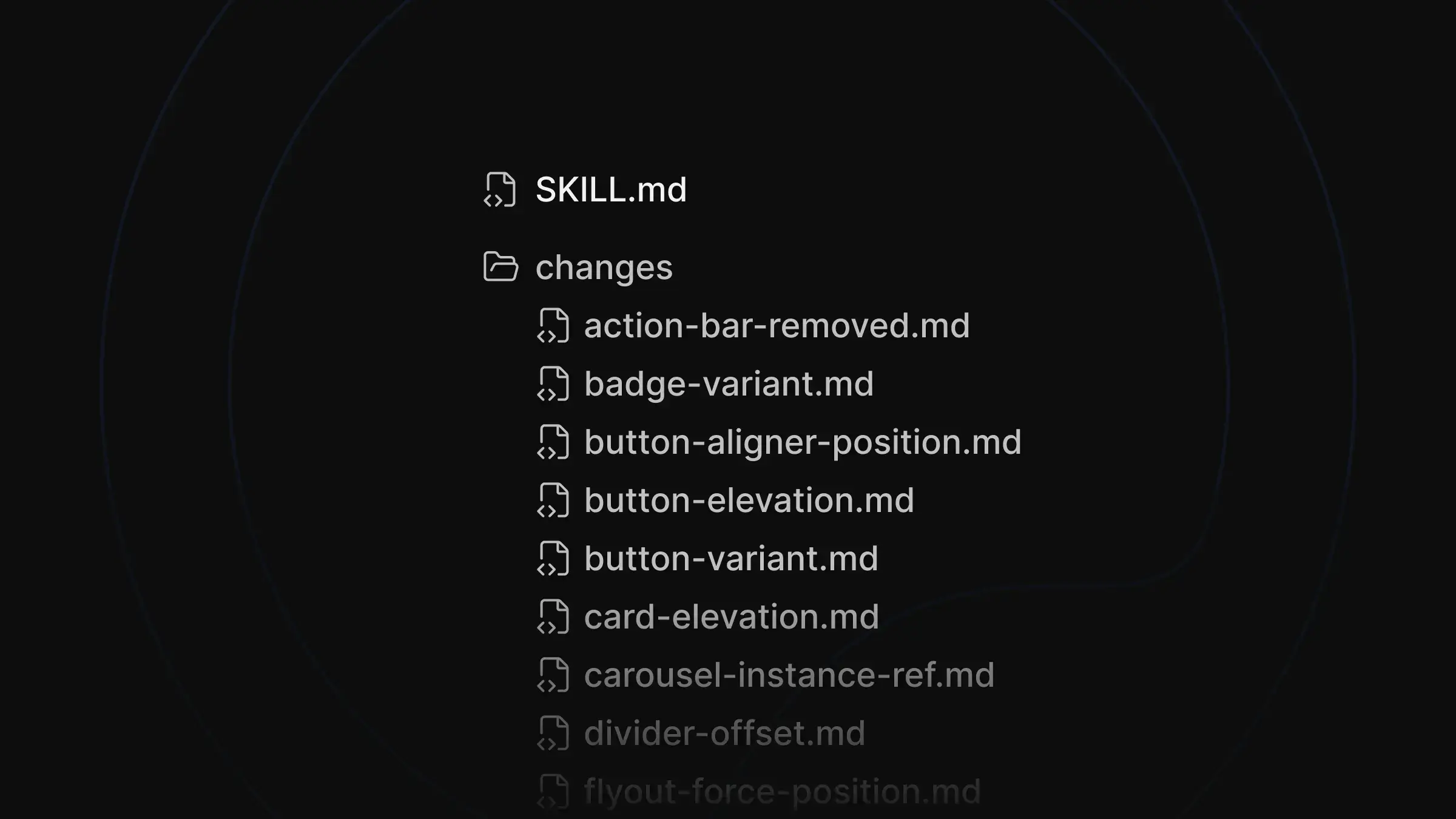
For this major release, we're also shipping a migration skill for your agents. It covers all breaking changes that can be migrated automatically and generates a migration report.
npx skills add https://github.com/reshaped-ui/reshaped --skill reshaped-v3-v4
Run the following command to install the skill in your project, then ask your agent to migrate a component or file to see how it can access the migration examples.
We've updated the theming system with additional design tokens and better defaults, like more vibrant colors, better typography distribution, and beautiful shadows. Here is a quick overview of the changes:
- ⚡ slate is the only theme we support now. The reshaped theme is officially deprecated after not being used as the default for a few months. If you still want to use the old reshaped theme, you can save its values from the v3 theme JSON file.
- ⚡ All theming utilities were moved to the @reshaped/theming package. You can install it alongside reshaped and always use the matching version.
- ⚡ Shadows now include a new outline variant as well as -intense modifiers for colored surfaces. New shadow values can still be used standalone, but they work best together with our updated border tokens, overlaying the borders. Most of the time we expect you to reach for low-level components like Card or Popover when implementing elevated surfaces, and you'll also see the same technique used in buttons, fields, and other components.
- ⚡ Typography token names were updated. Title 1-3 are now Headline 1-3 for marketing use cases, and Title 4-6 and Featured 1-3 were regrouped as Featured 1-6. Body-1 can be replaced with the same Featured-6 token, while Body-2 and Body-3 are now Body-1 and Body-2 respectively.
- ⚡ -rgb color variables were removed in favor of using relative color syntax. For example, use rgb(from var(--rs-color-foreground-neutral) r g b / 50%) instead of rgba(var(--rs-color-foreground-neutral-rgb), 0.5).
- Added new x0-5 and x1-5 unit tokens for more flexibility in condensed layouts.
- Increased border radius values, with the default switching from 4px to 6px.
- Easing and duration values were refined to make animations feel crisper.
- Added new -highlighted and -highlighted-faded color tokens for hover and highlighted states.
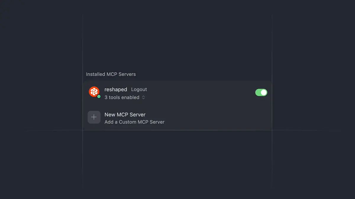
Our deployed Storybook now comes with MCP endpoints that provide your agent with access to canonical component examples coming directly from the stories. To enable it in your agentic tool, navigate to the MCP settings and add a new MCP with the permalink URL from the code snippet below.
For example, in Cursor its configuration will look like this:
{
  "mcpServers": {
    "reshaped": {
      "url": "https://main--5ed400f96e43cc00226d4df6.chromatic.com/mcp"
    }
  }
}
We have rebuilt our Figma library from scratch to match all visual changes, including new design tokens and layout adjustments. All components that used a custom slot utility are now built using native Figma slots released earlier this year.
It greatly simplifies component composition and allows you to build more complex layouts with ease. You don't have to worry about working with variants of the slot utility anymore and can just drop your components into the slot area and control them using auto-layout.
You will also see how it has simplified some of the components that use repeated content. For example, DropdownMenu doesn't have to implement variants based on the number of items used and instead leverages slots to insert MenuItems as recommended child components.
We're adding a new Examples section with more advanced component compositions built on top of Reshaped. It starts with form components, showing how lower-level primitives can be combined into production-ready patterns like custom selection menus, richer text fields, date inputs, file upload flows, and checkbox or radio groups.
These examples are meant to sit between isolated component docs and full templates, giving you realistic building blocks that you can copy and adapt directly in your product.
All components were adjusted for better visual alignment of their elements and better composition with other components. We're not mentioning all of these paper-cut fixes one by one, but you will notice minor changes throughout most components, like spacing adjustments and design token updates.
⚡ We've also removed the following components in favor of building your own custom versions using low-level primitives because they either duplicated functionality from other components or were becoming too opinionated:
- ActionBar was removed in favor of using View
- Hotkey was removed to be replaced by Badge
- Scrim, Stepper, and Timeline components were removed, and their custom versions can be built using low-level Reshaped primitives.
Additionally, we've made the following changes to the components:
- ⚡ Autocomplete, Checkbox, HiddenInput, Radio, Select, Switch, TextArea, TextField: Dropped onFocus and onBlur in favor of passing these handlers through the inputAttributes property.
- Autocomplete: Added a mutation observer to update the focused item after filtering the options.
- Avatar: Added an outline to the faded variant.
- ⚡ Badge: Removed the outline variant and updated the faded variant so it can be used instead.
- Badge: Fixed rendering of 0 integer children.
- Breadcrumbs: Improved gap rounding between text and icon.
- ⚡ Button: Renamed the elevated property to raised to match the shadow token name.
- ⚡ Button: Removed the faded variant.
- Button: Redesigned the outline variant to always use a neutral border and only change the text color.
- ⚡ Button.Aligner: Removed the deprecated position in favor of side, supported since v3.
- Calendar: Added renderDateValue support.
- Card: Added gap, direction, align, justify, and borderRadius properties to control the content layout without wrapping it with an additional View.
- ⚡ Card: Renamed the elevated property to raised to match the shadow token name.
- ⚡ Carousel: Dropped CarouselInstanceRef in favor of the CarouselInstance type supported since v3.
- ⚡ Divider: Renamed offset to inset and switched it to unit token values instead of pixel strings.
- ⚡ Flyout: Removed the deprecated forcePosition in favor of using the fallbackPositions property available since v3.
- ⚡ Flyout: Removed the deprecated fallbackMinWidth property.
- Flyout: Added a scrollable element with its own className and attributes. Padding now belongs to that element instead of the inner wrapper. This change should simplify controlling the content layout when working with dynamic resizing based on the viewport size.
- Flyout: Added onAfterOpen and onAfterClose handlers that trigger after the animation completes.
- Flyout: Added automatic position updates when containerRef resizes.
- Flyout: Fixed positioning inside shadow DOM and nested modals.
- Flyout: Added timeout cleanup on unmount.
- Flyout: Enabled the dismissible queue for hover flyouts. The dismissible queue controls the order of closing flyouts and overlays, and the new approach solves the reported edge cases.
- FormControl: Added the gap property and improved default gaps.
- ⚡ MenuItem: Removed the roundedCorners property.
- Modal: Optimized swipe behavior for mobile devices.
- NumberField: Added automatic value clamping to min and max on blur by default.
- ⚡ Overlay: Removed the onOpen handler to align the API with the Flyout API. Use onAfterOpen instead if you want to wait for the animation to complete or call the same function whenever you change its active value.
- ⚡ Popover: Removed the headless value for the variant property in favor of using the Flyout component.
- ⚡ Progress: Renamed to ProgressBar.
- ProgressBar: Added a new neutral color.
- Resizable: Added support for wrapping items and handles into reusable components.
- ScrollArea: Fixed a scrollable area resize issue.
- ⚡ Select: Removed the Select.Custom compound component. The new version renders a custom select when using Select.* compound components inside and renders a native select when using it with native option children.
- ⚡ Select: Removed the options property in favor of always using children.
- ⚡ Select: Selects with the multiple flag now require renderValue to be passed to display the selected values.
- ⚡ Select: Added selectedIconPosition property to control the position of the checkmark on the selected option.
- ⚡ Tabs: Removed automatic defaultValue detection. Tabs now always requires value or defaultValue to be passed explicitly.
- ⚡ Tabs: Renamed pills-elevated to pills-raised to match the shadow token name.
- Tabs: Added small variant.
- ⚡ Text: Updated variant names to match the new typography tokens.
- TextArea: Fixed min-height when resizing to a single row.
- TextField: Updated the default endSlotPadding to 2.
- ⚡ Toast: The Reshaped provider no longer provides global toast options for each region. toast.show() now accepts a width option with short and long presets, as well as custom CSS width values.
- ⚡ Toast: Removed the inverted color in favor of using the neutral color.
- ⚡ Toast: Removed the size option in favor of using orientation with the vertical preset.
- Toast: Toasts now support stacking with variable widths.
- View: Updated the shadow property to use the new shadow tokens.
- ⚡ View: aspectRatio no longer overrides the children's aspect ratio and only changes the dimensions of the view itself.
- useIsDismissible: Exported hook for working with the dismissible queue and building custom flyout-like components.