v4.1: LoaderText, ScrollArea fading and more
Modern design system for you and your agents
Reshaped provides accessible React and Figma components for building beautiful products or starting your own design system
npm install reshaped
EN
Esther Naomi
New

5 hours left
| Mo | Tu | We | Th | Fr | Sa | Su |
|---|---|---|---|---|---|---|
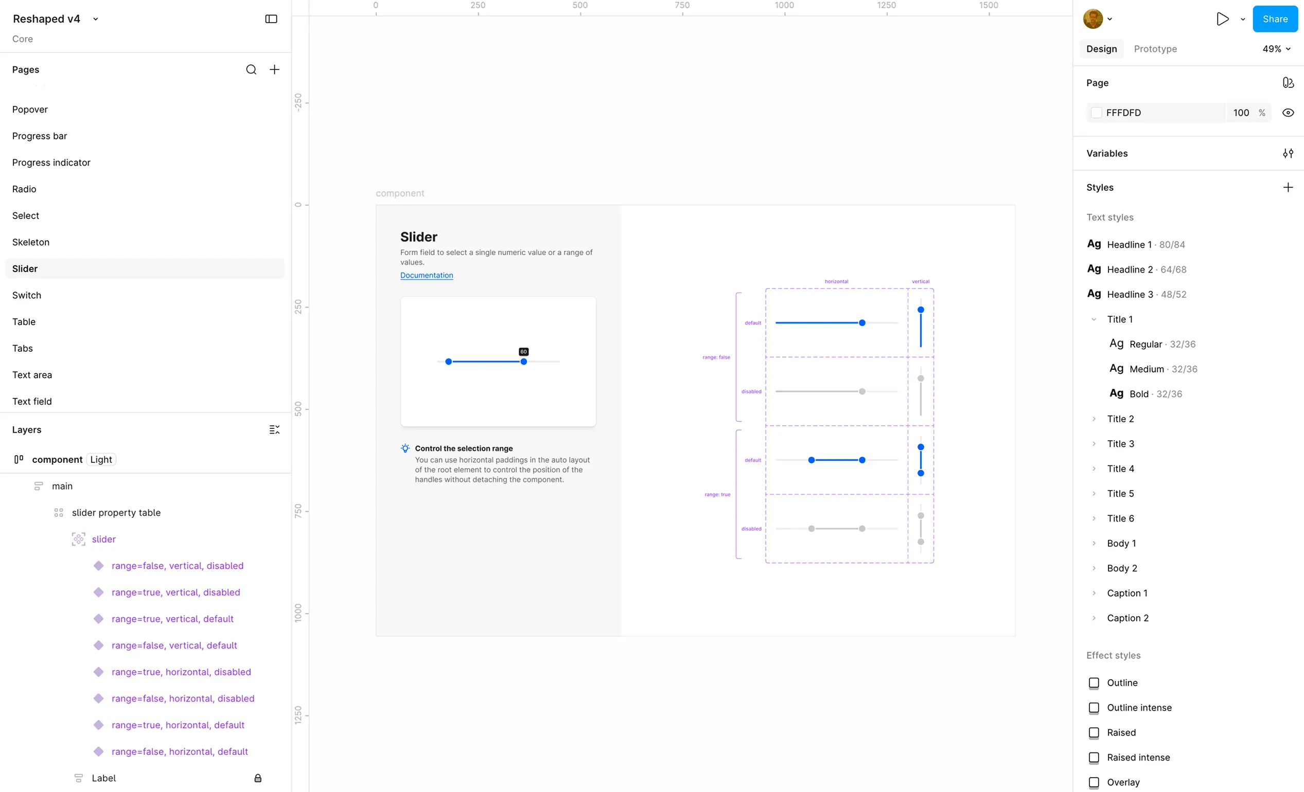
Design equals code
All components are available as both React and Figma libraries with completely aligned setup and using latest Figma features.
Responsive styles
Components props support responsive responsive syntax to adjust their behavior based on the viewport size.
Accessibility
WAI-ARIA compliant components with built-in screen reader support and low-level accessibility utilities for building your own components.
Semantic design tokens
Easy-to-learn theming layer and dark mode support that works for building your custom components. New themes can be automatically generated from a single color value.
TailwindCSS integration
Our theming layer can be easily imported in your Tailwind setup with easy access to all design tokens and dark mode support without manual configuration.
Internationalization
All components can be used with any language and come with built-in RTL languages support.
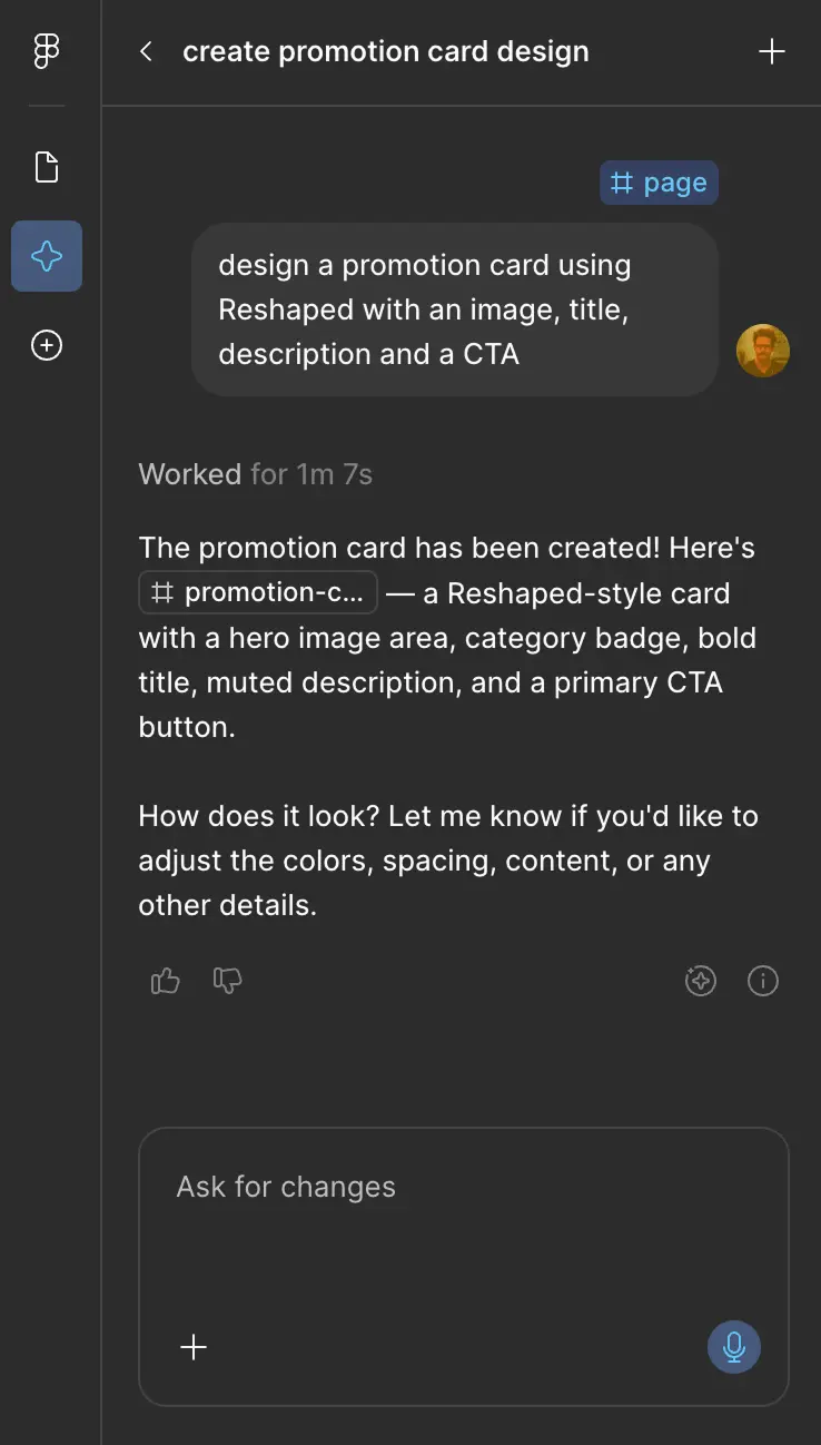
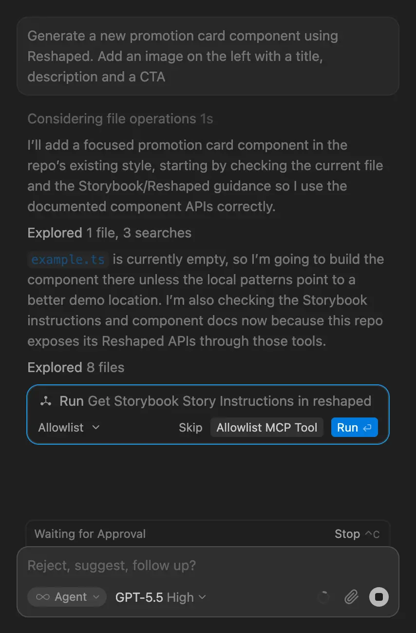
AI workflows
React library comes with a Storybook MCP support that works with all coding agents and Figma library seamlessly integrates with the Figma design agent.
TypeScript
Written in TypeScript with complete type definition coverage to enable autocompletion and type checking in your editor.
Framework support
Reshaped works with your favorite frameworks and bundlers including Next.js, Vite, and more. All components come with built-in RSC support.
We were in the middle of transitioning from a mix of different software stacks to a more streamlined setup, so finding a tool that could keep our frontend looking sharp and performing well was high on the list.
Reshaped quickly stood out for its atomic component approach and has been a great fit.
What truly made us commit to Reshaped was the team behind it: they actively support the product, genuinely care about user feedback, and keep the door open for new ideas.
It's rare to find that kind of dedication, and it made the choice an easy one.
Our engineers and designers compared multiple options and settled on Reshaped because it has the best Figma library (a 100% match with its React counterpart), a wide range of well-designed components, doesn't use CSS-in-JS or other heavy dependencies, works perfectly with server-side rendering, and is easy to integrate with frameworks like Next.js and Vite.
We’ve never regretted the decision to use Reshaped. The library dramatically boosted our development speed, enabling us to release our MVP faster than planned.
Reshaped is the gold standard of "just enough design system", where they have
figured out the minimal viable token architecture and an infinitely flexible base
component kit. I constantly look to them for inspiration.
Luis Ouriach
Designer Advocate, Figma
When we are working on new features, I enjoy checking out how Reshaped approached
the solution to that problem. It helps in my search for the best possible
approaches.
Olivier Tassinari
Co-founder and CEO, MUI
I love how Reshaped focuses on the “system” aspect of design systems, offering an
excellent set of core components with the latest Figma features. It’s a great
starting point for building products or creating your own design system.
Jordan Hughes
Product Designer, Creator of Untitled UI
Reshaped's superpower is its theming architecture because it has a fine balance of
flexibility and constraints. It is easy for the consumers to tweak the theme based on
their brand and product and yet it is logical enough to understand from the outside
and provides automatic dark mode support.
Kamlesh Chandnani
Principal Frontend Engineer, Razorpay
Professionally crafted React & Figma components for building beautiful products or starting your own design system
Built with Reshaped in Amsterdam ❤️
Contact us·
© Reshaped 2026